INTERESTING LAYOUTS
Below are THREE magazine layouts that I find interesting. Amoung these three layouts is one photograph that I have included for easy reference for Assessment 3-Range Boards. I believe the two page layouts below are both aesthetically pleasing for their use of colour and balance.
This layout has a significantly romatic and feminine feel to it. This mood has been created through the use of soft colours and simple imagery. The balance of text and imagery do not clutter the page, instead balancing the layout perfectly.
This layout is similar to the first, in that the text and imagery used balance each other and create an aesthetically pleasing layout. This layout is edgy, consisting of bright boarders, cropped images and slanted photographs to make the page stand out
.
This photograph stood out to me for its unusual use of proportion. Unlike the typical fashion photograph (in which we see the model/figure take up the entire frame), the white building instead maintains a dominate role here. While this building holds a large proportion of the frame, it also frames the model beautifully- a point of which really appealed to me upon viewing this image.
NOT SO INTERESTING LAYOUTS
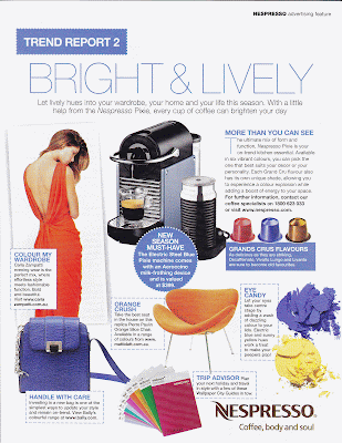
Below are THREE magazine layouts that I find not so interesting. These images need not be analysed individually, as they are all similar in aspects I do not find appealing. Although all the images used in this post have been pulled from the same magazine (Marie Clare) these images feel so commercial to me, and not to the high standard seen in the above images. The cropping and placement of images seem somewhat random, and the positioning of the text in relation has not been thought out in regards to their aesthetic appeal.


No comments:
Post a Comment